
 Home
HomeKey Considerations for Successful Custom Color Leaflet Printing
 Sep 29,2025

 SESE
SESE
Key Considerations for Successful Custom Color Leaflet Printing
1. Introduction
In an increasingly digital world, a well-designed, physically printed leaflet remains a powerful marketing tool. It creates a tangible connection with your audience, offering a sensory experience that pixels on a screen cannot replicate. However, achieving professional results requires more than just an eye-catching design. From choosing the right paper stock to ensuring color accuracy, every detail matters in custom printing. Partnering with an experienced provider like Sese Printing ensures that your leaflets not only stand out but also accurately reflect your brand’s image.
2. Design Considerations
Color Mode: CMYK vs. RGB. This is non-negotiable. Digital screens use the RGB (Red, Green, Blue) color model, while printers use CMYK (Cyan, Magenta, Yellow, Key/Black). Designing in RGB will result in muted and inaccurate colors when printed. Always set your design software (like Adobe InDesign or Illustrator) to CMYK mode from the very beginning.
Resolution: The Key to Crispness. For professional printing, all images and graphics must be high-resolution. The industry standard is 300 DPI (Dots Per Inch) at the final print size. Using low-resolution images from the web (often 72 DPI) will appear pixelated and blurry upon printing.
Bleed: This is a crucial 3mm extension of your background color or image beyond the final trim edge. It ensures that after your leaflet is cut to size, there are no unsightly white borders. Always include bleed in your document setup.
Safe Margins: Keep all critical text and logos at least 5mm inside the trim edge. This "safe zone" protects your content from being accidentally cut off during the trimming process.
Font & Text Size. Choose legible, professional fonts. Avoid very thin typefaces that may disappear when printed. For body text, a size below 8pt can be difficult to read. Always convert your fonts to outlines or embed them in your final PDF to prevent font substitution issues at the printer's end.
Brand Consistency. Your leaflet is an extension of your brand. Ensure it uses your official brand colors (using Pantone or specific CMYK values), logos, and typography consistently. This reinforces brand recognition and trust.
3. Paper and Material Selection
Weight/Thickness (GSM): GSM stands for Grams per Square Meter. A higher GSM means a thicker, more substantial feel.
130-170 GSM: Standard for everyday flyers and leaflets. Offers a good balance of quality and cost.
-
200-250 GSM: A premium, card-like feel. Ideal for high-end marketing materials or important announcements.
-
300+ GSM: Very thick, almost rigid. Perfect for luxury brand materials or business cards.
Finish:
-
Gloss: Creates vibrant colors and a shiny, professional look. Excellent for photo-heavy leaflets.
-
Matte/Satin: Offers a sophisticated, non-reflective finish that is easy to read and feels luxurious.
-
Uncoated: Provides a natural, tactile feel, often used for artisanal or eco-friendly brands.
-
At Sese Printing, we offer a vast portfolio of papers and finishes. Our experts can help you select the perfect material to match your brand's aesthetic and budget, ensuring your leaflet makes the right impression.
4. Printing Techniques & Custom Options
Custom printing allows you to elevate standard leaflets into memorable marketing pieces:
Offset vs Digital Printing: Offset is ideal for large volumes, while digital is better for small runs with quick turnaround.
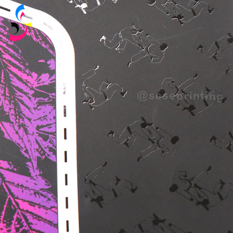
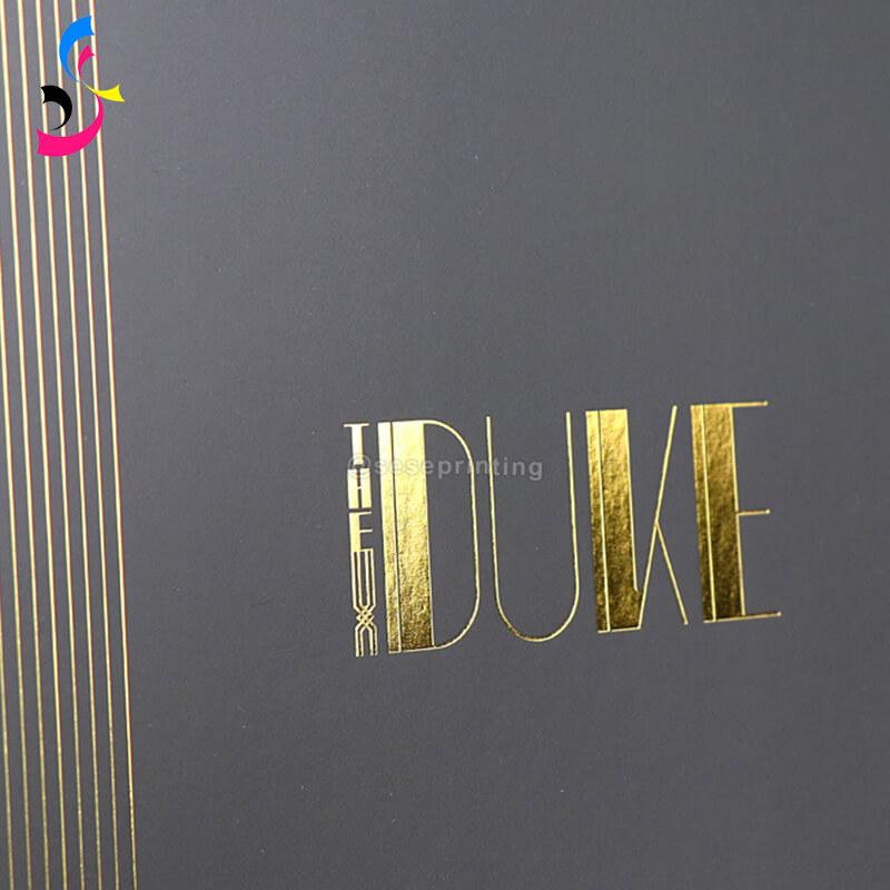
Special Finishes: Spot UV, foil stamping, and embossing can add a tactile and visual impact.
|
|
|
|
Spot UV |
Foil Stamping |
Embossing |

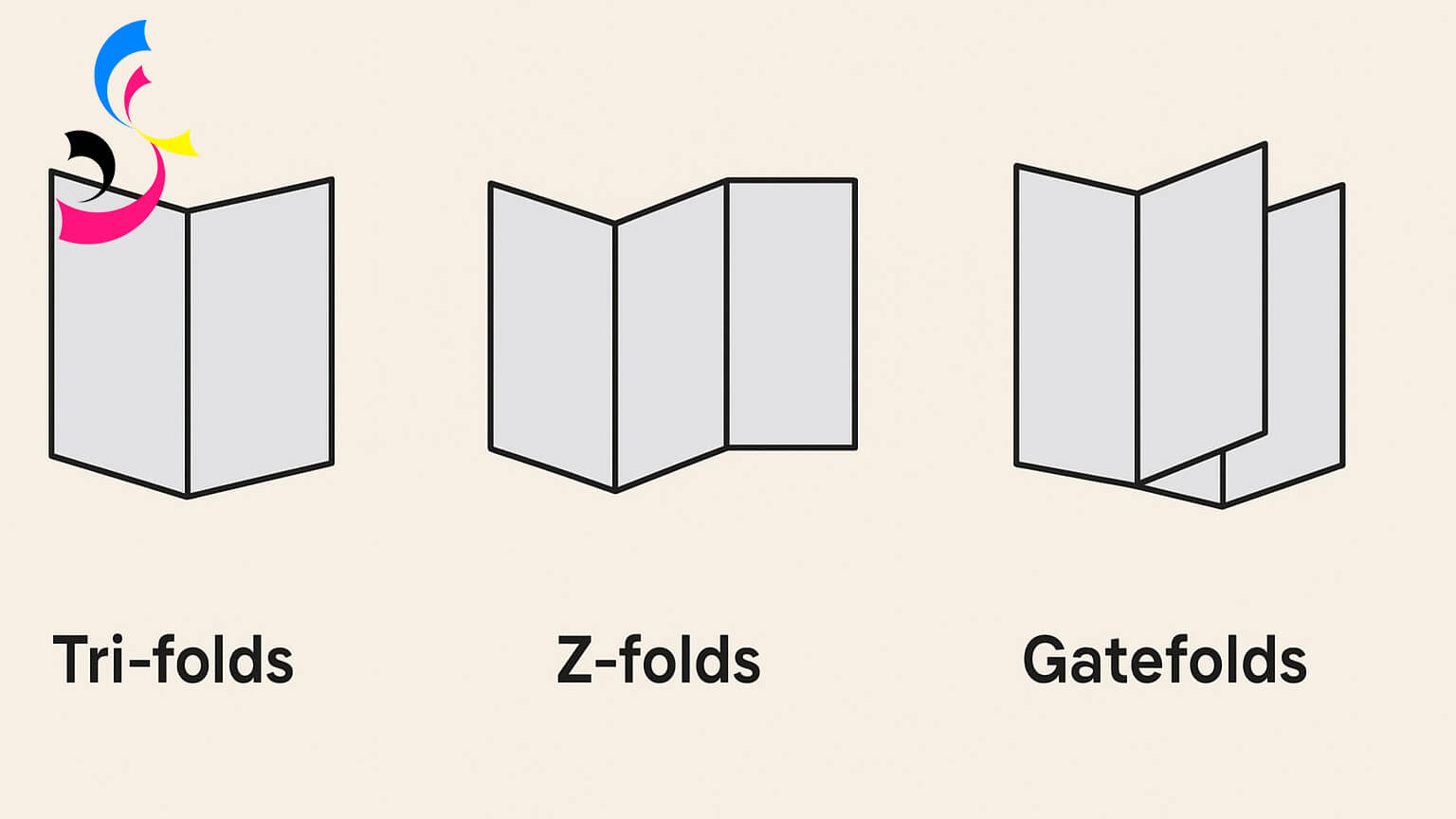
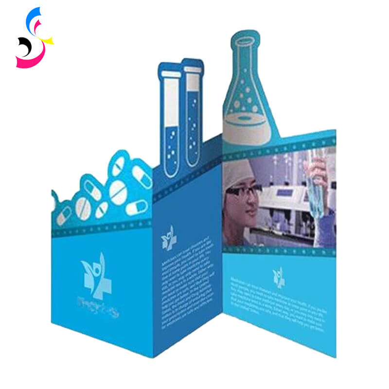
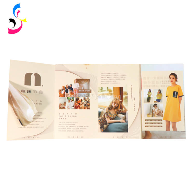
Unique Folding Styles: Tri-folds, Z-folds, and gatefolds enhance the way information is presented.
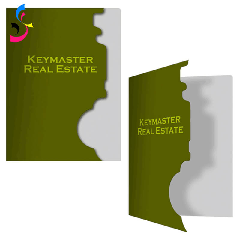
Die-Cut Shapes: Go beyond rectangles with custom-cut edges for a distinctive look.
|
|
|
|
At sese printing, we specialize in combining these techniques with modern equipment to create leaflets that truly resonate with your audience.
5. Color Accuracy and Proofing
Color inconsistencies can harm brand credibility. Always request a printed proof before mass production. Proofing helps detect color shifts, alignment issues, or text errors.
For corporate branding, Pantone colors ensure precise shade reproduction. sese printing offers advanced proofing options so you can approve the final look before committing to bulk printing.
6. Cost and Quantity Considerations
Understanding the cost drivers helps you plan your budget effectively.
-
Quantity: Unit cost decreases as quantity increases due to fixed setup costs being spread over more units.
-
Page Count & Size: More pages and larger sizes require more paper and ink.
-
Paper Choice & Finishing: Premium papers and special techniques like foil stamping add to the cost.
7. Finishing and Binding
Lamination: Gloss or matte lamination can protect leaflets from wear and tear.
Folding: Common folds include bi-fold (single fold), tri-fold (letter fold), and gatefold.
Cutting: Standard die-cutting for unique shapes or custom sizes.
Binding: For multi-page booklets, options include saddle stitching (staples along the spine) or perfect binding (a glued, flat spine for a more book-like feel).
8. Common Mistakes to Avoid
Submitting RGB files instead of CMYK.
Using low-resolution images that appear blurry in print.
Forgetting bleed and safe margins, leading to cut-off text or logos.
Overloading with too much text, making the leaflet hard to read.
Ignoring proofing, which can result in costly reprints.
By avoiding these pitfalls, you’ll save time, money, and ensure a polished final product.
9. Conclusion
A successful custom color leaflet is a symphony of thoughtful design, precise technical execution, and high-quality materials. By mastering these considerations, you empower your brand to create printed materials that not only capture attention but also command respect and drive action.
With its advanced printing technology, wide range of customization options, and commitment to quality, sese printing is your trusted partner for producing leaflets that not only look stunning but also perform in the marketplace. Whether you need small-batch digital prints or high-volume offset runs, sese printing helps you achieve professional, reliable, and cost-effective results.
 Where to Get Books with Sprayed Edges?
 You May Also Like


 Tel
Tel
 Email
Email
 Address
702 No. 21 Huizhong Road, Shiqiao St, Panyu District. Guangzhou city, Guangdong Province. China

Joy
 Whatsapp