
 Home
HomeHow to Prepare Artwork for Stenciled and Digitally Printed Book Edges?
 Jun 18,2026

 SESE
SESE
How to Prepare Artwork for Stenciled and Digitally Printed Book Edges?
Book edge printing has become one of the most popular finishing techniques in modern custom publishing, especially for special edition hardcovers, collector’s books, fantasy novels, and luxury gift editions. Whether using stenciled edges or digitally printed edges, the success of the final product depends heavily on how well the artwork is prepared.
Unlike standard cover printing, edge printing wraps across the entire book block, meaning the design must account for trim, folding, page curvature, and production constraints. Below is a complete guide to preparing professional artwork for custom book edge printing.
1. Understand the Difference: Stenciled vs Digital Edge Printing
Before preparing artwork, it is essential to choose the correct production method, as both require different design approaches.
|
|
|
|
Solid Color Edges |
Gradient Edges |
Bold Visual Patterns Edges |


Stenciled edge printing uses sprayed ink or stencil-based application to create solid colors, gradients, or simple decorative effects. It is ideal for minimalistic designs, metallic tones, or bold visual patterns. This method works best when the artwork is simple and high contrast.
|
|
|
|
Artwork Edges |
Character Illustrated Edges |
Complex Patterns Edges |
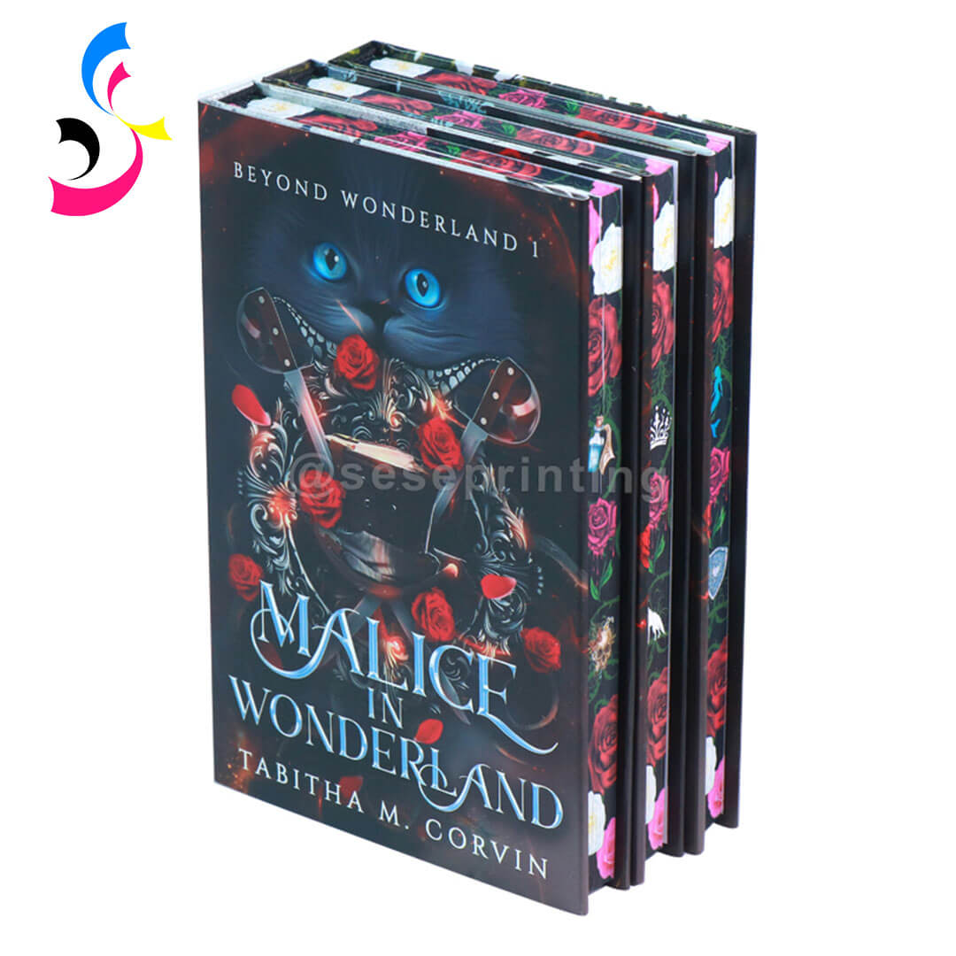

Digitally printed edges, on the other hand, use advanced printing technology to apply full-color images across the book block. This allows for detailed illustrations, photographic artwork, and complex patterns that wrap seamlessly around the edges.
In short:
-
Stenciled edges = simple, bold, decorative effects
-
Digital edges = detailed, full artwork printing
Understanding this difference helps avoid overcomplicated designs that may not translate well in production.
2. Use a Full Edge Bleed Layout
Bleed is a critical requirement in book edge printing and should always be treated as non-negotiable. Unlike standard flat printing, book edges consist of three separate printable surfaces: the fore-edge (front), the top edge, and the tail edge (bottom). Each of these surfaces must be handled individually in the artwork setup.
For production accuracy, designers should add 3–5 mm bleed beyond the actual finished dimensions of each edge. This extra margin ensures that slight shifts during clamping, trimming, or stacking will not expose any unprinted white areas.
It is also important to create separate artboards for the fore-edge, top edge, and tail edge. These should never be flattened into a single rectangle, because each edge has a different dimension ratio and printing behavior. Treating them separately ensures better control over alignment, scaling, and ink distribution.
For stenciled edge printing, bleed also helps absorb minor ink or paint spread during application. For digital edge printing, it prevents “starved edges,” where ink density may fade near the boundary if there is insufficient coverage allowance. In both cases, designers should think of the book block as a continuous wraparound surface, ensuring the artwork flows naturally and consistently when the book is closed.
At SESE Printing, once customer edge printing files are received, our pre-press team will carefully review every submission. We check file dimensions, bleed settings, resolution, and artwork precision to ensure they fully meet production requirements. If any issues are found, we will provide feedback or adjustments before printing begins, helping guarantee the final result is clean, accurate, and production-ready.
3. Prepare Artwork in High Resolution
Because book edge printing is applied across hundreds of pages, image quality directly affects the final appearance. Any low-resolution detail will be amplified when the artwork is stretched and segmented across the full book block, making clarity and sharpness essential for both stenciled and digitally printed edges.
For production, the recommended minimum is 300 DPI, while 400–600 DPI is preferred for detailed illustrations, fine patterns, or gradient-rich designs. Designers should avoid compressed images, screenshots, or web-optimized assets, as these often result in pixelation or color banding when printed on page edges.
Whenever possible, vector graphics (AI, EPS, or scalable PDF) should be used for shapes, line work, and typography. Vector elements ensure perfect sharpness at any scale and are especially useful for stencil-style edge designs where clean edges and solid color transitions are required.
4. Adjust Design for Page Deformation
One of the most overlooked aspects of book edge printing is page curvature. When a book is closed, the stacked pages naturally form a slight arc, which can subtly distort straight lines, grids, and continuous patterns across the edge surface.
To achieve a professional result, designs should avoid rigid grid systems or perfectly straight alignment across the full book block. Instead, artwork should allow for slight flexibility, especially in areas where lines or patterns cross the fore-edge. Designers should also anticipate how the image behaves when the book is fanned open versus fully closed.
In advanced production workflows, this deformation is often simulated before printing so that adjustments can be made in advance. This ensures the final printed edge appears visually balanced, smooth, and correctly aligned from multiple viewing angles.
5. Simplify Artwork for Stenciled Edge Printing
If you are opting for stenciled edges, resist the urge to overcomplicate your design.
-
Use vector-based software (Adobe Illustrator, CorelDRAW) and convert all text to outlines.
-
Avoid fine lines thinner than 2 pt—paint will spread and fill them in.
-
Avoid small serif fonts or script typefaces; bold sans-serif or oversized display fonts work best.
-
Limit your palette to 1–2 solid colors. If you need three colors, expect higher costs and longer setup time because each color requires a separate stencil pass.
-
Ensure high contrast between your design and the paper color. For example, white ink on a natural kraft paper edge requires an opaque underlay—your artwork must specify this.
Common stencil edge designs include floral silhouettes, geometric shapes, abstract patterns, and metallic accents. Simplicity ensures clean and consistent results during production.
6. Optimize Color Mode for Printing Accuracy
Color management is a key factor in achieving consistent, high-quality results in book edge printing, especially when designs are reproduced across different machines, paper types, and finishing methods.
All print-ready files should be created in CMYK color mode, as this is the standard for professional printing. RGB files should be avoided in final artwork because they often produce color shifts when converted during production, leading to unpredictable results on printed edges.
For projects that involve precise brand colors or luxury finishes, designers should provide Pantone (PMS) references wherever possible. This is especially important for stenciled edges, metallic tones, and corporate branding, where color consistency is critical across multiple production batches.
When special finishes are involved—such as foil stamping, varnish, or white ink layers—these elements should be clearly separated into dedicated layers or spot color channels. This allows the production team to control each effect independently and ensures accurate alignment between the artwork and finishing processes.
For digitally printed edges, color calibration becomes even more important due to variations in ink absorption along the cut paper surface. Slight differences in paper density, coating, and fiber direction can affect how colors appear once printed. Proper color profiling helps maintain consistency and ensures the final edge design looks rich, balanced, and intentional across the entire book block.
7. Match Edge Design with Book Cover and Endpapers
Edge printing should never be treated as an isolated decorative feature. In high-end custom book production, it is part of a broader visual system that connects the cover, interior design, and packaging into a unified creative concept. When these elements are aligned, the book feels intentional, collectible, and professionally crafted rather than assembled from separate design pieces.
A cohesive special edition typically ensures that the edge artwork complements the hardcover or dust jacket design, either by extending key visual elements or by using coordinated color palettes and motifs. For example, floral patterns, symbols, or abstract textures on the edges can echo similar graphics on the cover to create visual continuity.
Equally important is the relationship between edge printing and endpaper design. Endpapers often serve as the first and last visual impression inside the book, so matching their illustration style, tone, or pattern with the edge artwork helps create a seamless transition from exterior to interior.
Typography, illustration style, and color choices should also remain consistent across all components. A fantasy edition, for instance, might use dark tonal gradients, ornate lettering, and mystical symbols across cover, edges, and endpapers, while a minimalist literary edition may rely on restrained color palettes and clean, modern design language.
When packaging is included—such as a slipcase or rigid box—it should also follow the same visual direction. Extending the design system across packaging ensures the entire product feels like a single, carefully curated collectible set rather than separate production parts.
8. Prepare File Format Correctly for Production
Proper file preparation ensures smooth communication with the printing supplier and avoids production delays.
Recommended file formats:
-
PDF (print-ready, preferred format)
-
AI (vector source file)
-
PSD (layered design files for complex artwork)
-
TIFF (high-resolution raster images)
Additional preparation tips:
-
Include full bleed and trim marks
-
Outline all fonts
-
Flatten transparency when necessary
-
Clearly label layers for special effects (foil, varnish, etc.)
For digitally printed edges, suppliers may request page-by-page layouts or spine-to-edge mapping files.
9. Work Closely with a Custom Printing Supplier
Even when artwork is carefully prepared, book edge printing still requires professional production calibration. Factors such as paper thickness, coating type, binding method, ink absorption, and trimming tolerance all influence how the final edges will appear. For this reason, close collaboration with a custom printing supplier is essential to achieve stable, accurate, and high-quality results.
An experienced supplier does more than simply execute the print files—they help translate creative concepts into production-ready artwork. Before printing, technical checks such as layout validation, bleed confirmation, resolution review, and color profiling are carried out to ensure full compatibility with the selected edge printing method.
At SESE Printing, we specialize in custom book edge solutions, from handcrafted stenciled edges to high-precision digital edge printing. Our prepress team works directly with clients to refine artwork and ensure optimal production results.
We provide support including:
-
Reviewing artwork and suggesting necessary adjustments based on paper type and binding method
-
Supplying physical color swatches and sample books for accurate pre-production approval
-
Offering ready-to-use file templates with correct bleed, safety margins, and ICC color profiles
-
Managing complex edge effects such as split-color edges (different tones on top, tail, and fore-edge) and full wraparound or hidden-edge designs revealed when pages are fanned
At SESE Printing, we do more than print files—we collaborate with you to refine and elevate every detail. With experience serving luxury publishers, independent authors, and global brands, we ensure each project meets both creative expectations and professional production standards.
Conclusion
Preparing artwork for stenciled and digitally printed book edges requires a combination of creative design and technical precision. From choosing the correct printing method to adjusting for page deformation and ensuring correct file setup, every detail impacts the final quality.
Stenciled edges work best for bold and simplified designs, while digital edge printing allows for detailed, immersive artwork. When properly executed, edge printing elevates a book from a standard publication into a premium collectible object.
By working closely with a professional manufacturer like SESE Printing, publishers, authors, and designers can fully unlock the creative potential of custom book edge printing and produce high-quality special editions that stand out in the market. Contact us today for a personalized consultation, free templates, and a no-obligation quote.
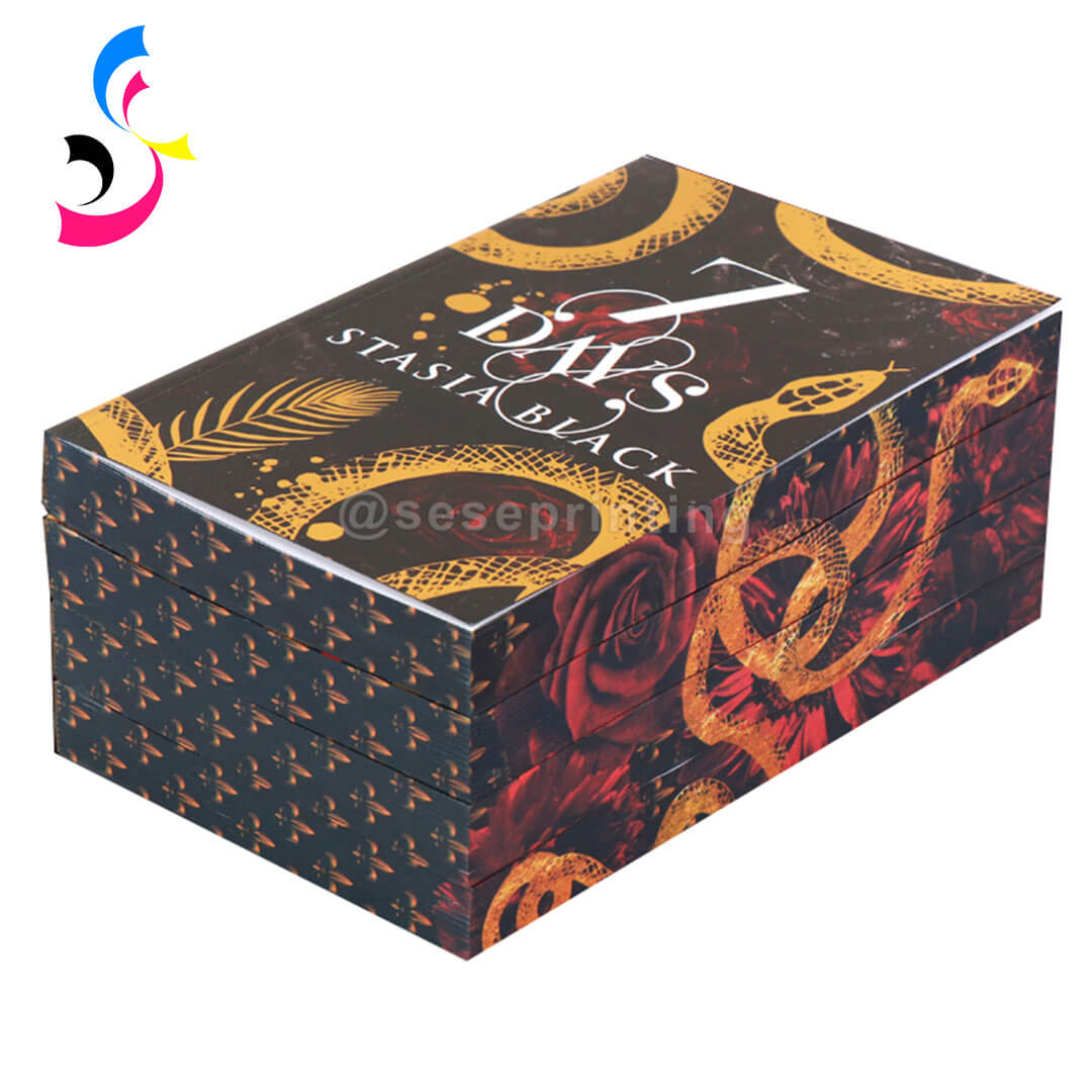
 Best Packaging Options for Special Edition and Collector’s Books?
 You May Also Like


 Tel
Tel
 Email
Email
 Address
702 No. 21 Huizhong Road, Shiqiao St, Panyu District. Guangzhou city, Guangdong Province. China

Joy
 Whatsapp