



 Home
HomeRGB vs CMYK for Book Printing
 Sep 03,2026

 SESE
SESE
RGB vs CMYK for Book Printing
Color plays a major role in how a printed book looks and feels. Whether you are producing a children's picture book, hardcover novel, photography book, coffee table book, or premium special edition, the colors shown on a computer screen may not look exactly the same after they are printed.
One of the most important factors behind this difference is the RGB vs CMYK color model. RGB is primarily designed for digital screens, while CMYK is the standard color model used in professional printing. Understanding how these two color systems work can help authors, publishers, designers, and brands prepare better artwork for custom book printing.
1. RGB vs CMYK: What Is the Difference?
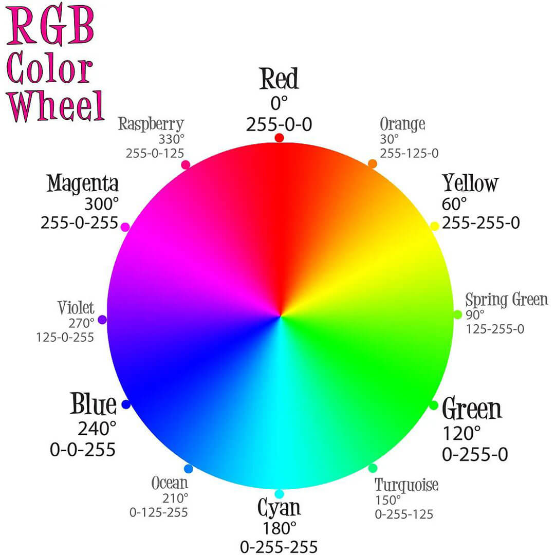
RGB
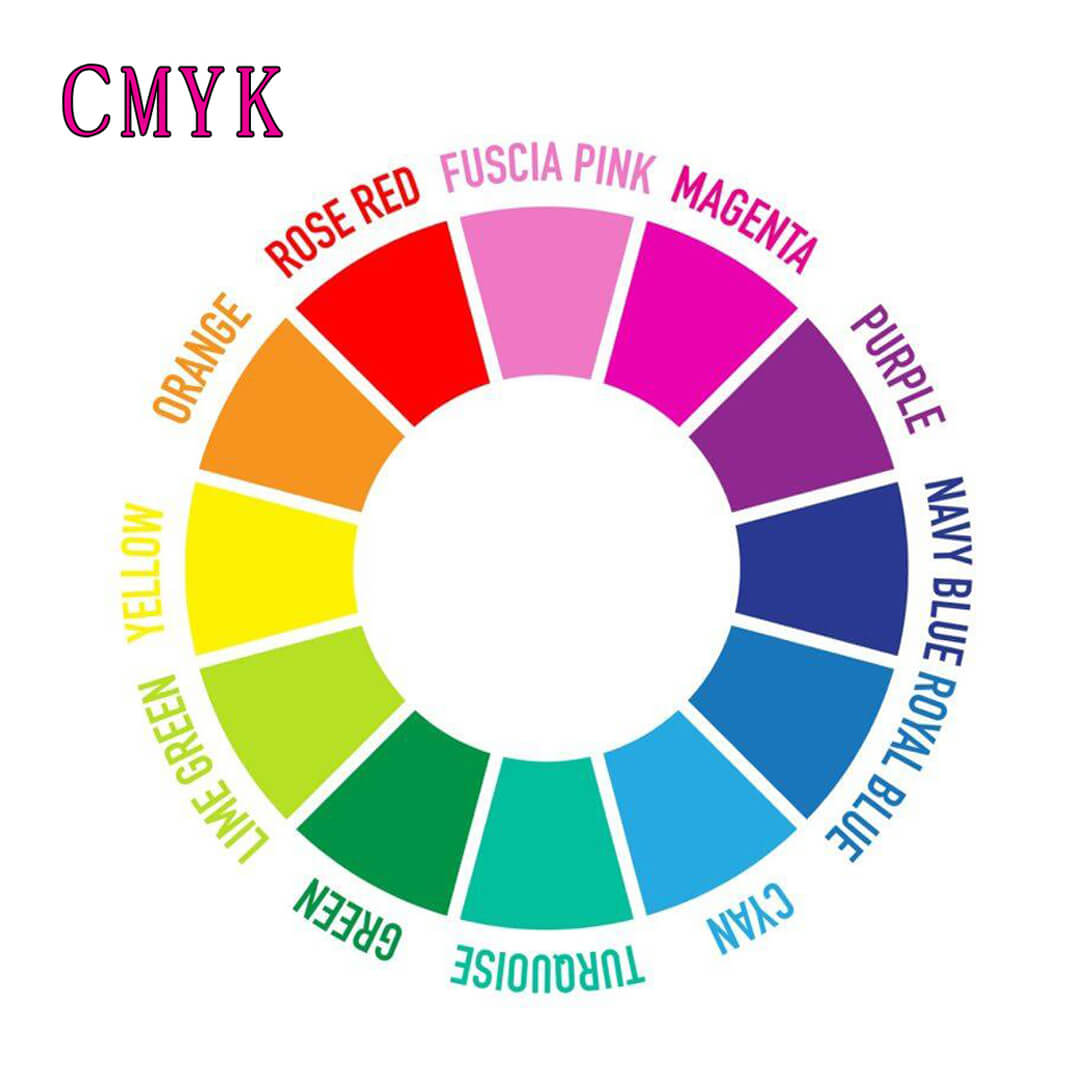
CMYK
RGB and CMYK are two different color models designed for different purposes.
RGB stands for Red, Green, and Blue. It is an additive color model primarily used by digital screens, including computers, smartphones, tablets, and cameras. Colors are created by combining different levels of red, green, and blue light.
CMYK stands for Cyan, Magenta, Yellow, and Key (Black). It is a subtractive color model used in commercial and professional printing. Instead of producing color with light, CMYK creates colors by layering printing inks onto paper.
The main difference can be summarized as follows:
| Feature | RGB | CMYK |
| Primary | Use Digital screens | Physical printing |
| Color | Creation | Light Ink |
| Main Colors | Red, Green, Blue | Cyan, Magenta, Yellow, Black |
| Color Gamut | Generally wider | Generally narrower |
| Common Applications | Websites, digital graphics, photography | Books, packaging, brochures, magazines |
| Recommended for | Book Printing | Usually converted before production Standard choice for process printing |
RGB can display extremely bright and saturated colors because a screen produces color using light. However, printing inks cannot reproduce every RGB color. This means some colors may change when RGB artwork is converted to CMYK for physical printing.
2. Why CMYK Matters for Custom Book Printing
Printers use CMYK inks. Offset and digital presses are built around the CMYK color model. Converting your RGB file to CMYK at the last moment is like translating a poem using a computer—you'll lose nuance, and the results won't be what you intended.
CMYK determines what's achievable. Some colors exist in RGB but simply cannot be reproduced in CMYK. Bright electric blue, neon green, and vivid orange are classic examples. Understanding CMYK's limitations helps you design realistically.
Custom printing gives you control. With custom book printing, you're not locked into generic color output. You can request proofs, choose paper types, and work with ICC profiles to get the closest possible match to your vision.
Professional results demand CMYK. Publishers, libraries, and retailers expect print-ready CMYK files. Submitting RGB artwork signals inexperience and increases the risk of delays or disappointing results
3. What Happens When You Print an RGB File?
Printing an RGB file does not necessarily mean the book will fail to print. However, the RGB artwork will normally need to be interpreted or converted into a printable color space during the production workflow.
This conversion can result in visible color changes.
Common changes may include:
- Reduced saturation: Bright digital colors may appear more muted in print.
- Color shifts: Blue may become more purple, green may appear more yellow, or other colors may shift during conversion.
- Changes in dark areas: Shadow details and very dark backgrounds may appear different depending on ink settings and paper.
- Different overall appearance: A complete illustration may look slightly different when viewed on a screen compared with the physical printed page.
For this reason, designers should not rely solely on how artwork looks on a monitor. For color-sensitive custom book printing projects, reviewing the converted artwork and, when appropriate, requesting a physical proof can provide a more realistic reference.
4. How to Convert RGB Artwork to CMYK for Book Printing
Converting RGB artwork to CMYK is an important step when preparing files for custom book printing. Since RGB is designed for digital screens and CMYK is used for most professional printing processes, converting and checking your artwork before production can help reduce unexpected color changes.
Follow these steps to prepare your artwork for book printing:
Step 1: Complete Your Artwork
Finish all illustrations, photographs, graphics, typography, and page layouts before converting the color mode. Make sure the design, dimensions, and content are finalized so you do not need to make major changes after color conversion.
Step 2: Make a Backup of the Original RGB File
Before converting the artwork, save a copy of the original RGB file. This allows you to return to the original artwork if you need to make adjustments or create a digital version for websites and other screen-based applications.
Step 3: Convert RGB Images to CMYK
Open your artwork in professional design software such as Adobe Photoshop or Adobe Illustrator and convert the RGB images or artwork to CMYK.
The exact CMYK color profile should follow your custom book printer's specifications whenever possible. Different printing processes and production environments may use different color profiles.
Step 4: Review the Colors After Conversion
Do not assume that the colors will remain exactly the same after conversion. Carefully check important elements such as bright colors, skin tones, gradients, photographs, illustrations, and large areas of solid color.
Some highly saturated RGB colors may become less vivid after conversion because they cannot be reproduced exactly within the CMYK color gamut.
Step 5: Check the Book Cover
Pay particular attention to the cover because it is one of the most visually important elements of the book. Review the background colors, title, illustrations, photographs, and other major design elements.
For custom hardcover printing and special editions, also consider how CMYK colors will interact with finishes such as foil stamping, embossing, spot UV, or lamination.
Step 6: Check the Interior Pages
Review the interior pages individually and as a complete book. This is especially important for children's books, photography books, art books, and other publications containing extensive full-color artwork.
Check for noticeable differences between adjacent pages and make sure important images maintain a consistent visual appearance.
Step 7: Check Paper and Printing Specifications
Color appearance can be affected by the selected paper stock. Before finalizing your files, confirm the paper type and printing method with your printer.
For example, coated and uncoated paper can produce different visual results even when the same CMYK values are used.
Step 8: Request a Physical Proof
For color-sensitive custom book printing projects, consider requesting a physical proof before mass production. A proof allows you to evaluate how the artwork actually looks on the selected paper rather than relying only on a computer monitor.
Step 9: Complete a Prepress Check
Before submitting the final files, check the complete document for:
- CMYK color mode
- Image resolution
- Bleed
- Trim size
- Safe margins
- Black settings
- Fonts
- Cover and spine dimensions
- Special finishing areas
Step 10: Submit the Print-Ready Files
Once the colors and technical specifications have been checked, export the final print-ready files according to your custom printer's requirements.
The key is not simply converting RGB to CMYK, but reviewing the converted artwork in the context of the complete printing project. Paper, printing technology, color profiles, and finishing can all influence the final appearance of your custom book.
5. RGB vs CMYK for Book Covers and Interior Pages
The cover and interior pages have different requirements—and different tolerances for color variation.
Book Covers
- Cover stock (usually thicker, 300–350gsm) holds ink differently than interior paper. Colors may appear more saturated and vibrant.
- Covers often include special finishes—foil stamping, embossing, spot UV, and lamination—which affect color perception.
- Brand consistency matters. If your cover uses brand colors, those should be specified as Pantone (spot) colors, not CMYK approximations.
- RGB-to-CMYK conversion for covers should be done carefully, with a hard proof on the actual cover stock.
Interior Pages
- Text pages are typically black-and-white or two-color (black plus one spot color). Converting to CMYK for grayscale images requires care—RGB-to-grayscale conversion often produces muddy results.
- Full-color interiors (art books, photography books, cookbooks) require careful color management. Paper type matters enormously—more on this below.
- Illustrations and diagrams should be converted to CMYK and tested at final trim size. Small details can become muddied if colors shift.
Recommendation
- Cover: Always work in CMYK from the start. Request a physical proof.
- Interior: Use CMYK for color pages. For black-and-white, use grayscale mode (not RGB-to-grayscale conversion).
6. RGB vs CMYK for Different Custom Book Types
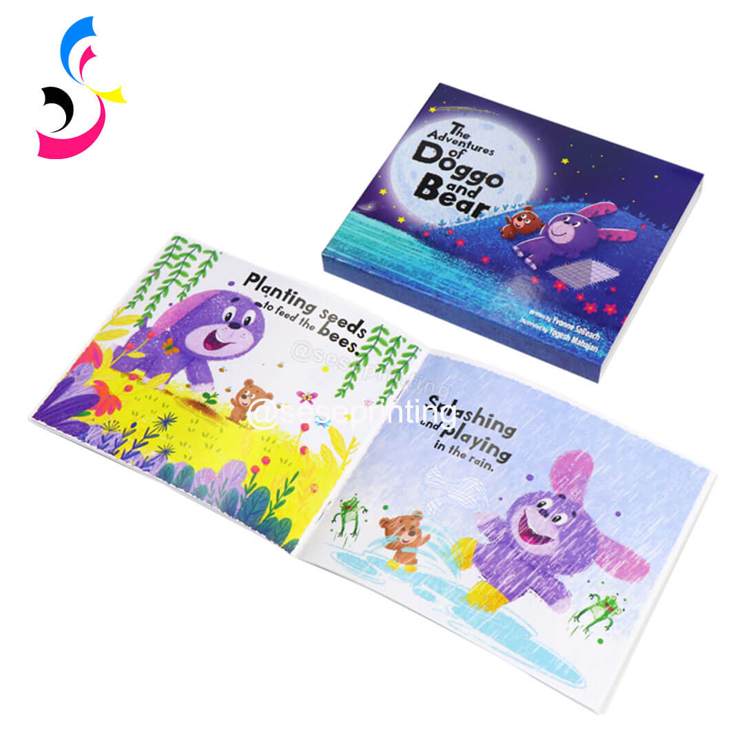
Children's Books
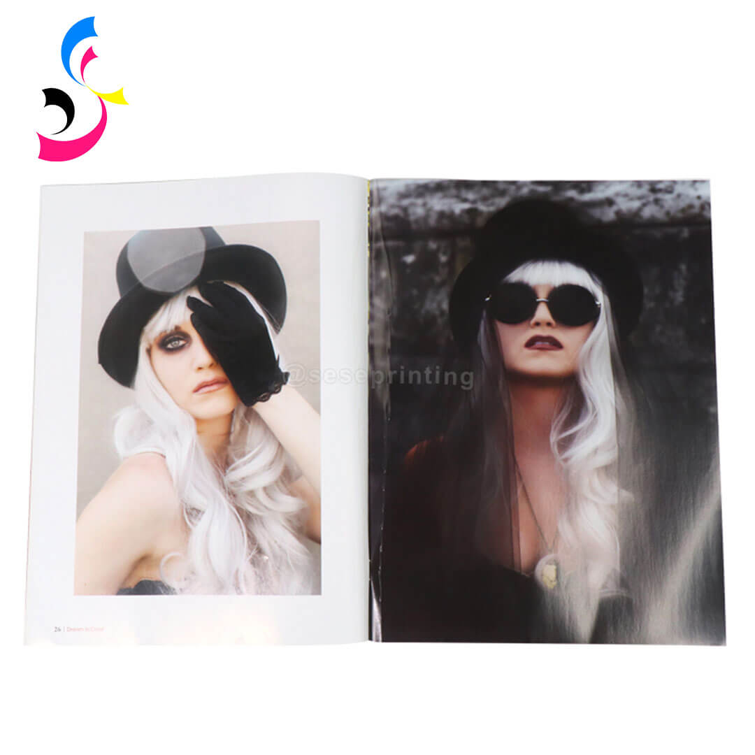
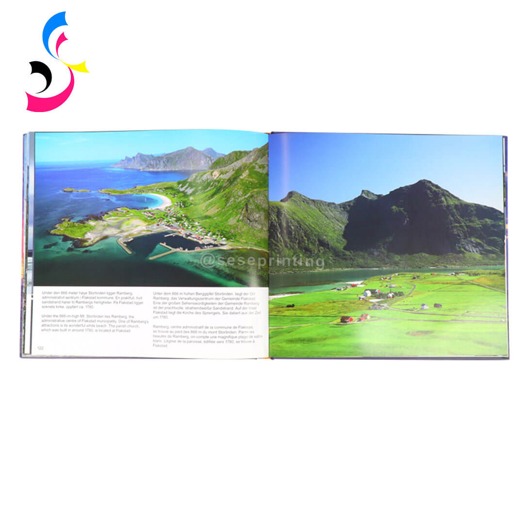
Photography Books
Art Books
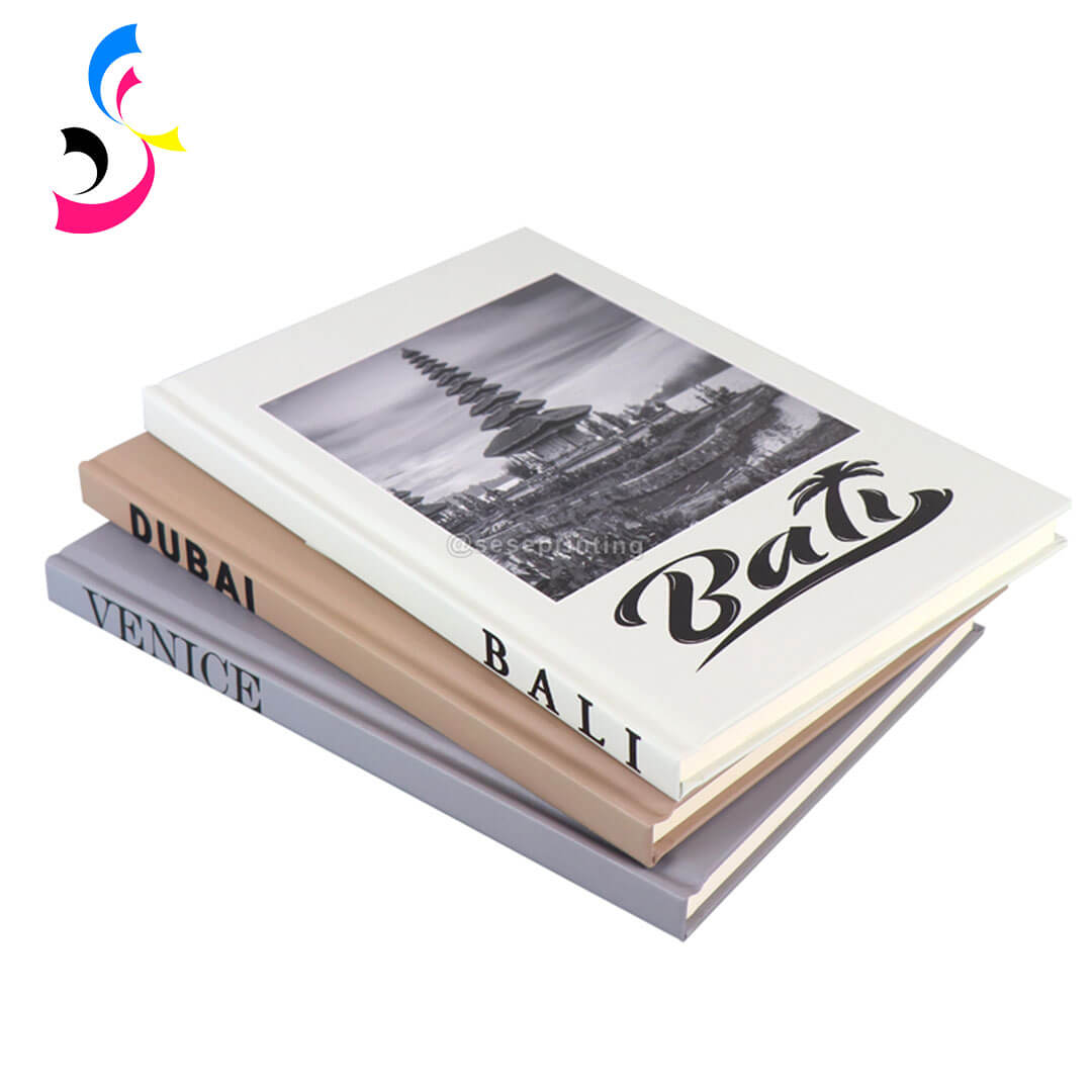
Coffee Table Books
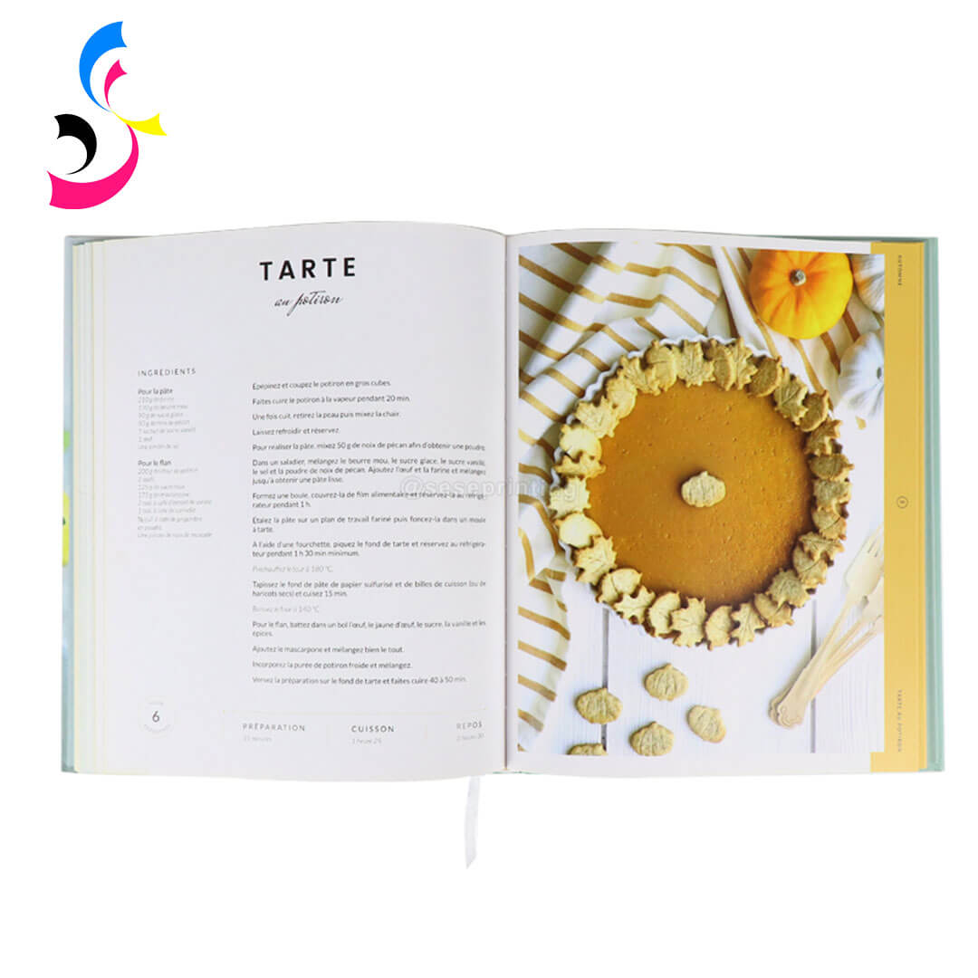
Recipe Books
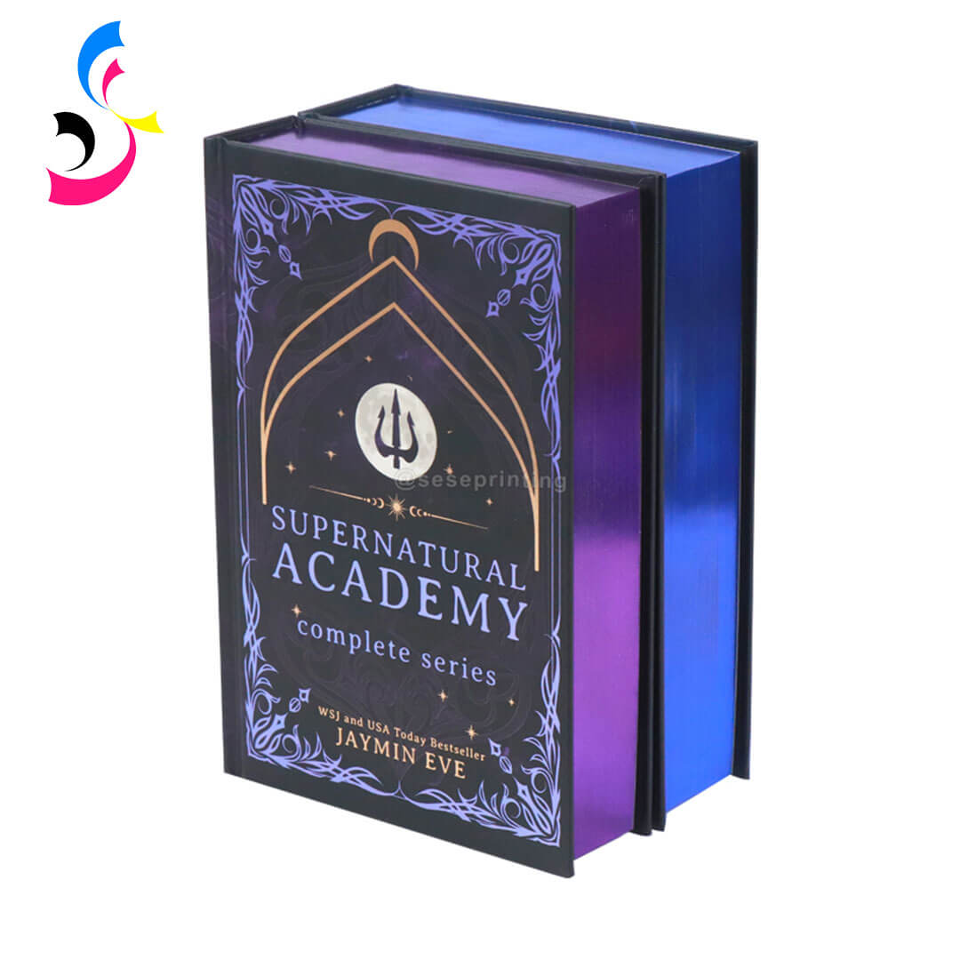
Fantasy and Special Edition Books
Different types of books can have different color priorities.
Children's Books: Illustrations often use bright and highly saturated colors. Designers should pay close attention to color conversion and the interaction between ink and paper.
Photography Books: Skin tones, landscapes, product photography, and subtle gradients require careful color management. A physical proof can be especially useful for important photographic projects.
Art Books: When reproducing paintings, illustrations, or other artwork, preserving the visual characteristics of the original work is a major consideration.
Coffee Table Books: Large images and full-page photography make color reproduction an important part of the premium presentation.
Recipe Books: Food photography depends heavily on natural-looking reds, greens, yellows, browns, and skin tones. Color shifts can make food images look noticeably different.
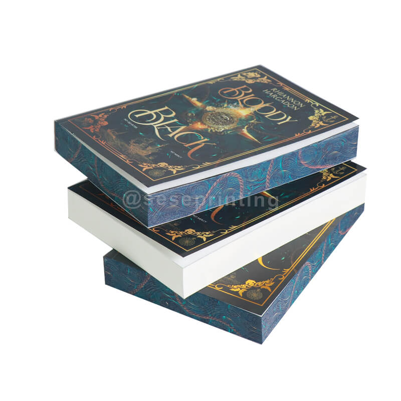
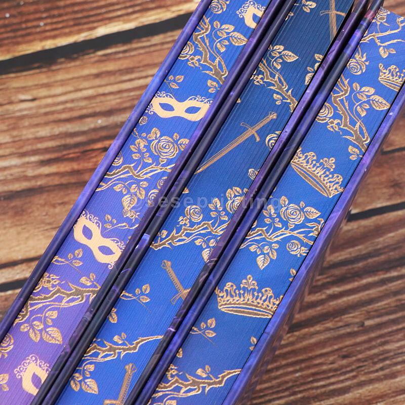
Fantasy and Special Edition Books: Fantasy books may use deep backgrounds, atmospheric illustrations, metallic effects, or dramatic color combinations. Combining CMYK printing with specialty finishes can create a more distinctive result.
This is why custom book printing should be approached as a complete production project rather than simply uploading a digital file.
7. Does Paper Affect CMYK Color?
Absolutely—and often more than you expect. Paper is the foundation your ink sits on, and it changes how colors appear.
Coated vs Uncoated Paper
Coated paper has a smooth, sealed surface that holds ink on top. Colors appear:
- Sharper and more vibrant
- Higher contrast
- More consistent
- Glossy or matte finishes affect how light reflects
Uncoated paper absorbs ink into the paper fibers. Colors appear:
- Softer and more muted
- Warmer (especially on cream or off-white stocks)
- Less consistent across different paper batches
Paper Color
- Bright white paper reflects more light and makes colors "pop"—ideal for art books and photography
- Cream/natural paper adds warmth but can shift blues toward green and neutrals toward yellow
- Colored paper (rare for interiors) dramatically alters color perception—avoid unless you've tested extensively
Paper Weight
- Heavier paper (120gsm+) absorbs less ink and holds color better
- Lighter paper (60–80gsm) may allow ink to show through (ghosting) and reduce color saturation
8. How Custom Book Printing Can Improve Color Consistency
Color consistency becomes increasingly important when producing books in larger quantities or printing multiple editions of the same title.
A professional custom book printing workflow can incorporate several steps to improve consistency.
- Prepress Checking: Print-ready artwork can be reviewed before production to identify potential color and file issues.
- Color Management: A controlled color workflow helps ensure that digital artwork is interpreted consistently throughout production.
- Proofing: For projects with demanding color requirements, proofs can help identify differences before the full production run.
- Consistent Production: Using controlled printing conditions and professional equipment can help maintain consistent color reproduction throughout a production run.
- Paper Selection: Selecting the appropriate paper stock helps achieve the desired visual appearance and supports the overall design.
For publishers and brands, these processes are particularly valuable when the same book needs to be reproduced repeatedly or as part of a larger series.
9. What Should You Check Before Sending Files to a Custom Book Printer?
Before submitting files for custom book printing, it is useful to complete a preflight check.
- Color Mode: Confirm whether your printer requires CMYK files and which color profile should be used.
- Image Resolution: Make sure images are sufficiently high resolution for the final printed size. Low-resolution images may appear blurry or pixelated.
- Bleed: Add the required bleed to pages and cover files so that images and background colors extend beyond the trim area.
- Safe Area: Keep important text, logos, and design elements away from the trim and binding areas.
- Black Settings: Check how black elements are prepared, particularly large black backgrounds and small black text.
- Fonts: Make sure fonts are properly embedded or converted according to the printer's file requirements.
- Cover and Interior Files: Prepare the cover and interior according to the printer's specifications, including spine width and trim size where applicable.
- Color-Critical Elements: Pay particular attention to brand colors, skin tones, photography, illustrations, and large solid-color areas.
- Paper and Finishing: Confirm the intended paper stock and finishing before finalizing color expectations.
A good file preparation process can reduce production problems and make communication between the designer, publisher, and printing manufacturer much easier.
10. CMYK, Pantone, and Special Finishes: What Is the Difference
Many authors confuse CMYK, Pantone, and special finishes. Here's the breakdown:
CMYK (4-Color Process)
What it is: Standard full-color printing using cyan, magenta, yellow, and black inks
Best for: Full-color photographs, illustrations, and most book interiors and covers
Cost: Cost-effective for full-color jobs
Color accuracy: Good, but not exact—colors can vary between presses and paper stocks
Pantone (Spot Colors)
What it is: Pre-mixed inks that produce exact, consistent colors
Best for: Brand logos, corporate colors, and design elements that must match precisely
Cost: More expensive than CMYK (each spot color adds cost)
Color accuracy: Exact—specify a Pantone number and you get that color, every time
Common uses: Cover logos, headers, brand elements, and special edition details
Special Finishes (Applied on Top of Printing)
These are not color models—they're enhancements added after printing:
|
Finish Description |
Effect |
|
Foil stamping |
Metallic or colored foil pressed onto the cover Gold/silver titles, shimmering accents |
|
Embossing |
Raised design elements Tactile, three-dimensional effect |
|
Debossing |
Recessed design elements Subtle, elegant texture |
|
Spot UV |
Glossy highlights on specific areas Contrast between matte and gloss |
|
Lamination |
Matte or gloss protective coating Protection and sheen |
|
Soft-touch lamination |
Velvet-like matte finish Luxurious feel, resists fingerprints |
11. RGB vs CMYK: Common Color Problems in Book Printing
Bright Colors Look Less Vibrant
Some RGB colors are outside the CMYK color gamut. After conversion, they may appear less saturated.
Blue Looks Different in Print
Bright digital blues can be particularly difficult to reproduce exactly using CMYK inks. The printed version may appear darker or slightly shifted.
Black Backgrounds Look Different
Large black areas require appropriate ink settings. Incorrect preparation can affect density, detail, and overall appearance.
Skin Tones Change
Photography containing people can reveal relatively small color differences. Proper image preparation and proofing can help identify potential issues.
Colors Differ Between Paper Types
A design may look different on coated and uncoated paper even when the same CMYK values are used.
Different Print Runs Look Slightly Different
Production conditions, paper batches, ink, and other variables can influence color consistency. For important repeat orders, maintaining consistent specifications is essential.
The key point is that color accuracy is a complete production process, not just a file-format issue.
12. Final Checklist: How to Prepare Color-Accurate Files for Custom Book Printing
Before sending your artwork to a custom book printer, use this checklist:
- Confirm the required color mode and CMYK profile.
- Convert RGB images according to the printer's specifications.
- Review colors after conversion.
- Use high-resolution images.
- Check bleed and trim areas.
- Keep important content within the safe area.
- Check black text and large black areas.
- Confirm fonts and embedded elements.
- Review both cover and interior files.
- Consider how your selected paper will affect color.
- Confirm special finishes such as foil, embossing, and spot UV.
- Use Pantone colors when appropriate for specific color requirements.
- Request a physical proof for color-critical projects.
- Confirm all specifications before mass production.
Conclusion
Understanding RGB vs CMYK for book printing is an important part of preparing professional artwork for physical books. RGB is optimized for digital displays, while CMYK is designed for reproducing colors with printing inks. Because the two color systems have different capabilities, colors displayed on a screen may change when they are converted and printed.
For custom book printing, color should also be considered together with paper stock, printing processes, proofing, binding, and special finishing. Whether you are producing a children's picture book, hardcover novel, photography book, coffee table book, or premium special edition, proper file preparation can help create a more predictable final result.
At SESE Printing, custom book production can be tailored around different book formats, materials, printing requirements, and finishing options. By preparing print-ready artwork and confirming specifications before production, publishers, authors, and brands can turn digital designs into high-quality physical books with greater confidence.
 Self-Published Children’s Books: Custom, Safe & Engaging Printing Solutions
 You May Also Like


 Tel
Tel
 Email
Email
 Address
702 No. 21 Huizhong Road, Shiqiao St, Panyu District. Guangzhou city, Guangdong Province. China

Joy
 Whatsapp