



 Home
HomePrinted Endpapers: Design Ideas and File Preparation Guide
 Aug 12,2026

 SESE
SESE
Printed Endpapers: Design Ideas and File Preparation Guide
Printed endpapers are one of the most important yet often overlooked elements in custom book printing. Positioned at the inside front and back of a hardcover book, endpapers connect the book block to the cover while also offering a powerful opportunity for visual storytelling and brand expression.
In modern custom book printing, printed endpapers are widely used in special edition books, collector’s editions, fantasy novels, art books, and premium hardcover publications. They help transform a standard book into a highly designed, collectible product.
1. What Are Printed Endpapers?
Endpapers—also called endsheets—are the sheets of paper that sit at the very front and back of a hardcover book. They serve two essential purposes:
Structural support: Endpapers physically attach the book block (the interior pages) to the cover. One side of the folded sheet is glued to the inside cover (called the pastedown), while the other side remains free as the flyleaf. Without endpapers, a casebound hardcover book would not hold together properly.
Aesthetic opportunity: This is where printed endpapers add value. Instead of leaving them blank, they can be customized with colors, patterns, illustrations, maps, textures, or branding elements that enhance the reader’s first and last impression of the book.
In a standard hardcover book, endpapers are made from two folded sheets—one at the front and one at the back. Each sheet creates two visible pages (a pastedown and a flyleaf side), meaning the full endpaper system provides four printable pages of design surface in total (two at the front and two at the back).
|
|
|
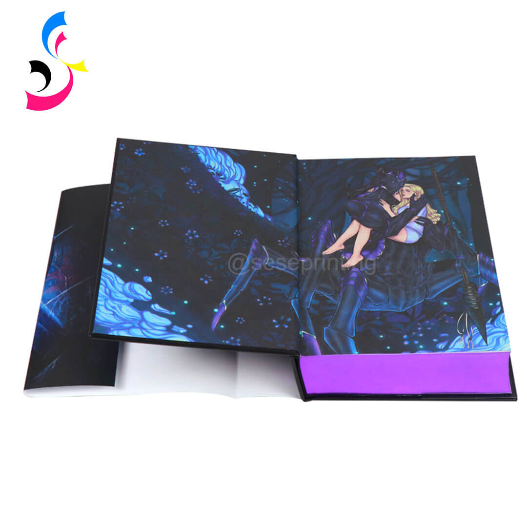
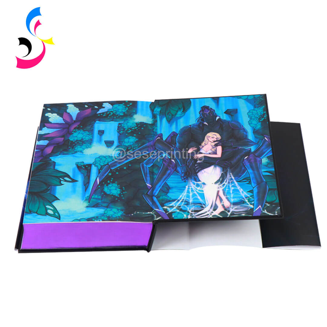
This makes endpapers a valuable space for storytelling and visual branding in custom book printing.
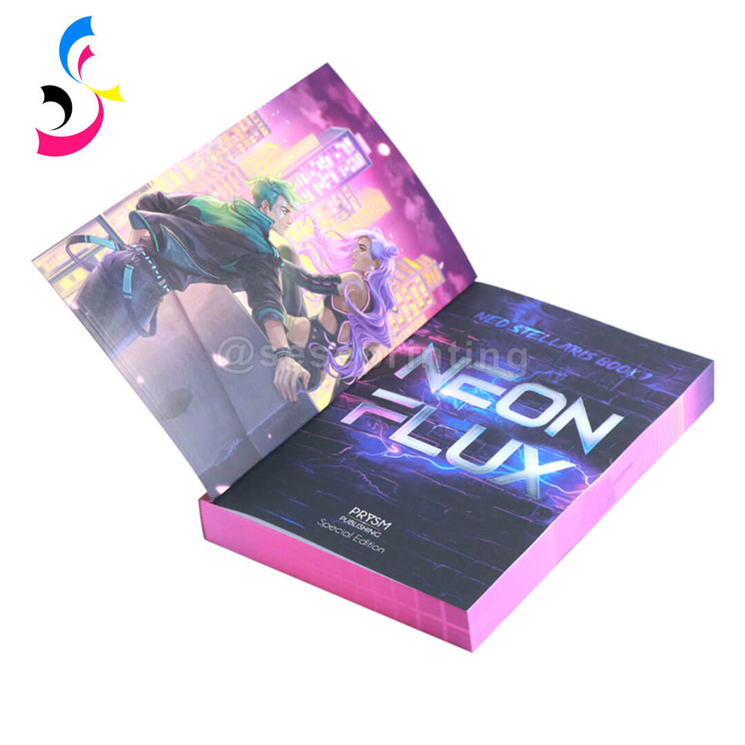
What about paperbacks? Perfect-bound paperbacks do not require endpapers for structural reasons. However, a similar visual effect can be achieved by designing the inside covers and the first and last interior pages as coordinated design spreads.
2. Design Ideas for Printed Endpapers
Endpaper design plays a key role in defining the reader’s first impression. Below are some popular design directions used in professional book printing:
-
Pattern-Based Designs: Repeating patterns such as geometric shapes, floral motifs, or abstract textures create a clean and stylish look suitable for many genres.
-
Story-Driven Illustrations: For fiction and fantasy books, endpapers can visually expand the story world. Maps, symbols, or scene illustrations are commonly used.
-
Minimal Luxury Style: Simple gradients, soft textures, or monochrome layouts are ideal for premium editions, giving a refined and elegant appearance.
-
Full Artwork Spread: Some special editions use full-bleed illustrations across both endpapers, creating a dramatic and immersive opening experience.
-
Brand or Author Identity: Publishers and authors often use logos, signature patterns, or visual identity systems to maintain consistency across a book series.
3. File Preparation Requirements for Endpaper Printing
Proper file preparation is essential to avoid production delays or costly mistakes. Here are the critical technical requirements for printed endpapers:
File Format and Structure
-
Supply endpapers as separate PDF files—one for the front endsheets and one for the back
-
Each endsheet file represents a single flat sheet that will be folded during binding
-
For self-ends (where the first and last pages of the interior file act as endpapers), include them in the content file
Size and Bleed
-
All pages must match the book's final trim size in document properties
-
Apply a minimum 3mm bleed for standard endpapers
-
For hardcovers with flaps, additional bleed allowances may be required
-
Keep critical text and artwork at least 3mm away from page edges and away from the spine fold area, as part of the sheet will be glued down
Color Space
-
Use CMYK color space (or Grayscale) for offset printing—RGB or Lab colors are not acceptable
-
Follow ISO12647-2:2013 standards with proper Output Intent information in your PDF
-
Convert all spot colors to CMYK unless you specifically intend to print them as separate Pantone colors
-
For foil, UV spot, or embossing files, use 100% black and convert objects to outlines
Resolution and Fonts
-
Color images should be 300 dpi minimum; bitmap files should be 600 dpi
-
All fonts must be embedded in the PDF
-
Fine black text and lines should be 100% black (not RGB or registration color)
-
Line width should not be less than 0.2 pt
Design Layout Considerations
-
Design both sides of the sheet if needed—one side for the pastedown (glued area) and one for the flyleaf (visible area)
-
Avoid placing important elements too close to the spine edge, as part of the sheet will be glued down and become hidden
-
If your artwork is a spread, self-ends can reduce the gutter issue—but note that the interior stock must be at least 100lb
4. Common Printing Techniques for Endpapers
Endpapers can be produced using a variety of printing and finishing techniques, depending on the creative direction, print budget, and overall positioning of the book. The right combination of techniques can significantly enhance both visual impact and perceived value.
|
|
|
|
Full Color Printing |
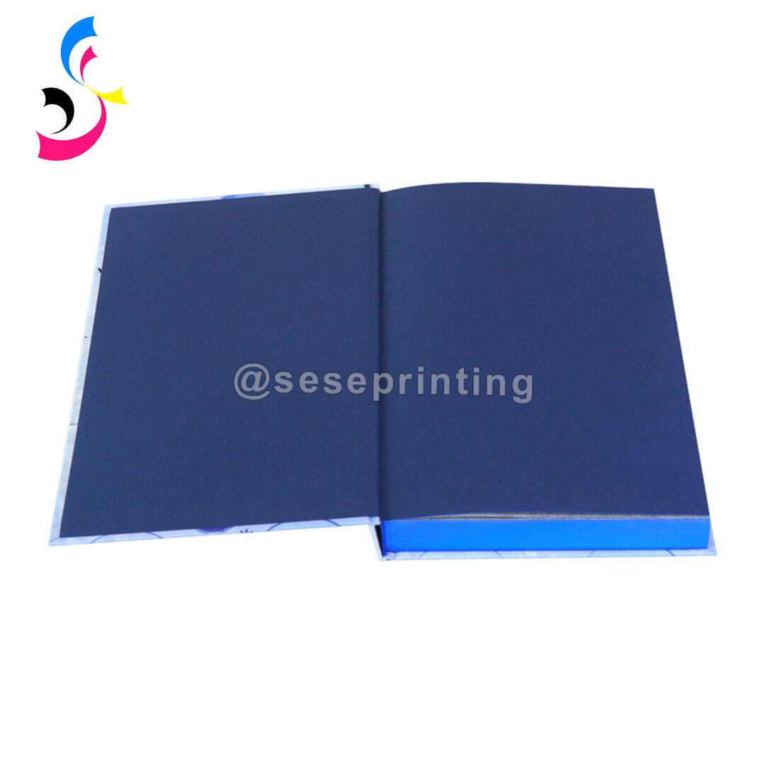
Pantone Spot Colors |
Foil Stamping |

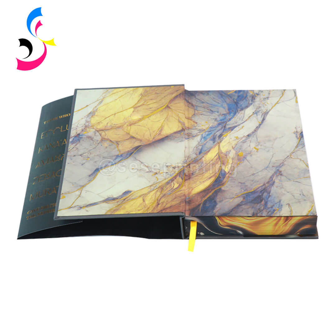
-
Full-Color Printing: This is the most commonly used method for endpapers. It supports detailed illustrations, photography, and complex graphic designs. Full-color printing is ideal for fiction, illustrated books, and any project that requires rich visual storytelling or detailed artwork reproduction.
-
Pantone Spot Colors: Pantone printing is used when precise color consistency is required, especially for brand-driven books or minimalist luxury designs. It delivers clean, solid color output and is often used for corporate publishing, design-focused books, or series where color accuracy must remain consistent across multiple print runs.
-
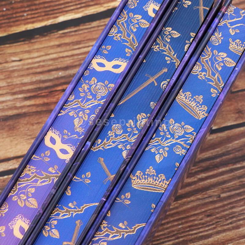
Foil Stamping: Foil stamping adds metallic or reflective elements to the endpaper design. Gold, silver, black foil, and holographic effects are commonly used to create a premium or collector’s edition feel. Foil is typically applied to key design elements such as logos, symbols, or patterns to enhance visual hierarchy and luxury appeal.
-
Spot UV Coating: Spot UV is used to highlight specific areas of the design with a glossy finish while keeping the rest of the surface matte. This contrast effect is ideal for modern, high-end designs where subtle detail emphasis is needed without adding color or texture.
-
Textured and Gradient Printing Effects: Soft gradients, watercolor transitions, and simulated texture effects are widely used to add depth and atmosphere to endpaper designs. These effects work well for artistic books, fantasy novels, and mood-driven visual storytelling, where a subtle and immersive background is preferred over bold graphics.
-
Specialty Combined Finishes: In premium book production, multiple techniques are often combined—for example, full-color printing with foil accents, or Pantone base printing with Spot UV highlights. These combinations are commonly used in special editions, collector’s sets, and luxury hardcover books to create a more layered and tactile visual experience.
5. Matching Endpapers with Overall Book Design
Your endpapers should feel like an intentional part of the book's design ecosystem, not an afterthought.
-
Coordinate with Your Cover: The most straightforward approach is choosing an endpaper color that complements or intentionally contrasts with the cover. A brown cover might have red endpapers; a pink cover could use clashing orange or blue; a black cover could feature bright orange for dramatic effect.
-
Extend the Story: Children's books excel at this. In Goodnight, Goodnight, Construction Site, the endpaper illustrations gradually show a crane lowering the sun across four spreads—extending the story's mood before the text even begins. Think of endpapers as a visual prologue and epilogue.
-
Create Brand Consistency: For series or collections, consistent endpaper design across books builds recognition. Use the same pattern in different colors, or a recurring emblem that ties all volumes together.
-
Consider the Reader Experience: Ask yourself: What do I want the reader to feel when they open this book? Warmth and comfort? Intrigue and mystery? Elegance and luxury? Your endpaper design—color, texture, imagery—should deliver that emotional cue before a single word is read.
-
Balance with Practicality: Remember that part of the endpaper will be glued down. Don't place critical information or design elements too close to the spine fold. For self-ends, ensure the interior paper stock is heavy enough (minimum 100lb) to function as endsheets.
6. File Checklist Before Production
-
Files supplied as separate PDFs—front endsheets and back endsheets
-
Document size matches the final trim size specified in your order
-
3mm bleed applied to all edges (or as specified by your printer)
-
CMYK color space used (not RGB or Lab)
-
All fonts are embedded in the PDF
-
Images at 300 dpi minimum; bitmaps at 600 dpi
-
Critical text/artwork kept 3mm away from edges and spine fold
-
Spot colors converted to CMYK (unless printing separate Pantone colors)
-
Foil/UV/embossing files use 100% black and objects converted to outlines
-
Both sides of the sheet designed (pastedown and flyleaf) if needed
-
No JPEG2000 compression used
-
Blank pages included if required for correct page sequence
-
Files named clearly with sequence (e.g., "book_endpapers_front.pdf")
Conclusion
Printed endpapers are a powerful design feature that significantly enhances the perceived value of a book. They combine structure and storytelling, helping create a memorable reading experience from the very first page.
With the right design approach and proper file preparation, endpapers can elevate a standard hardcover into a premium, collectible edition.
At SESE Printing, we specialize in custom book printing for authors, publishers, and creative brands worldwide. From printed endpapers and dust jackets to sprayed edges, foil stamping, embossing, and luxury packaging, we help bring every detail of your book to life with precision and quality.
If you are planning a custom hardcover or special edition book project, printed endpapers are one of the most effective ways to enhance your book’s visual impact and market value.
 Custom Book Printing Trends: Sprayed Edges, Holographic Foils & Eco-Friendly Hardcovers
 You May Also Like


 Tel
Tel
 Email
Email
 Address
702 No. 21 Huizhong Road, Shiqiao St, Panyu District. Guangzhou city, Guangdong Province. China

Joy
 Whatsapp